︎︎︎SHOREDITCH
Corporate Design – The corporate design of the Shoreditch District in London reflects the creativity, open-mindedness and diversity of the neighborhood.
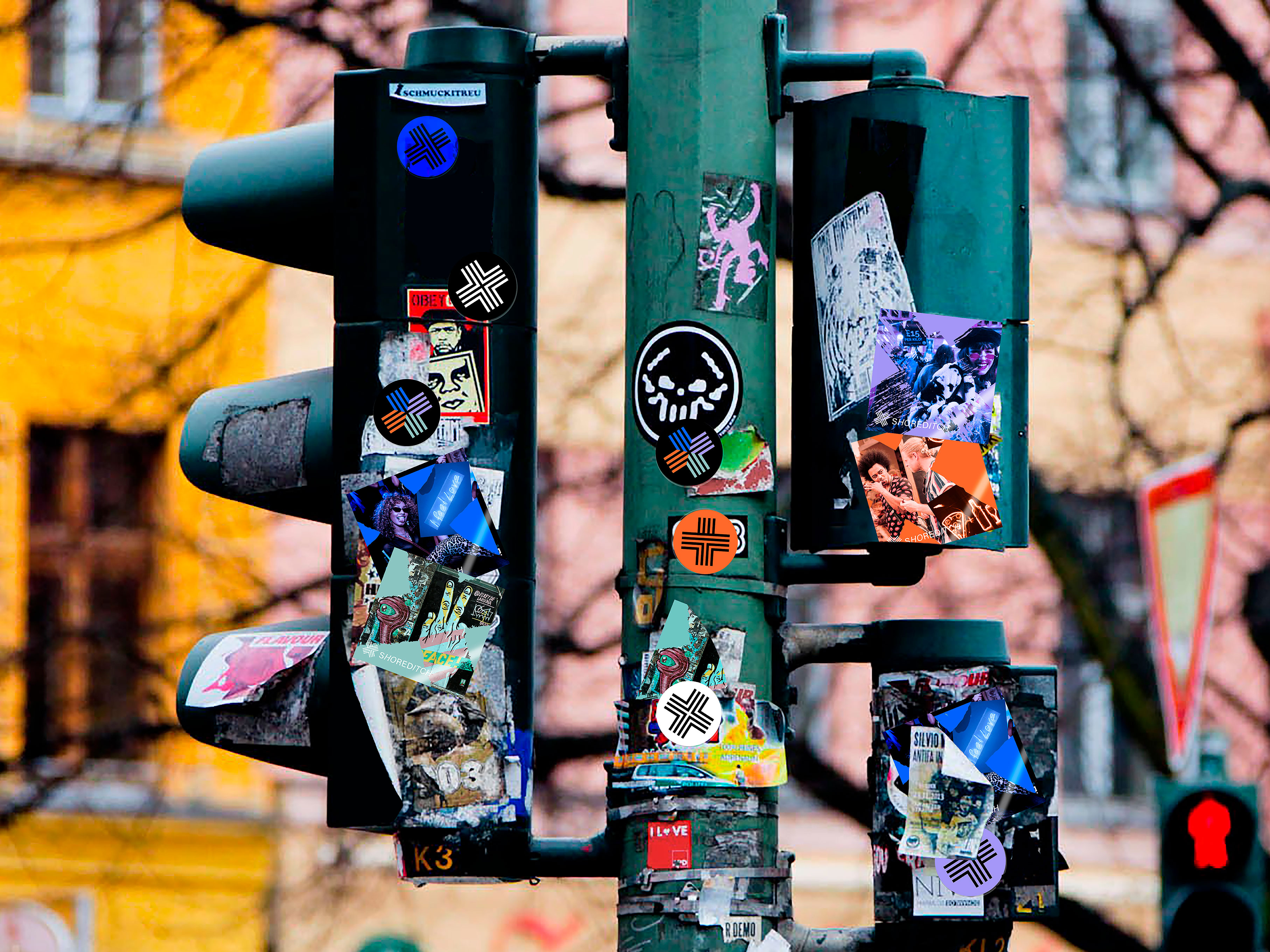
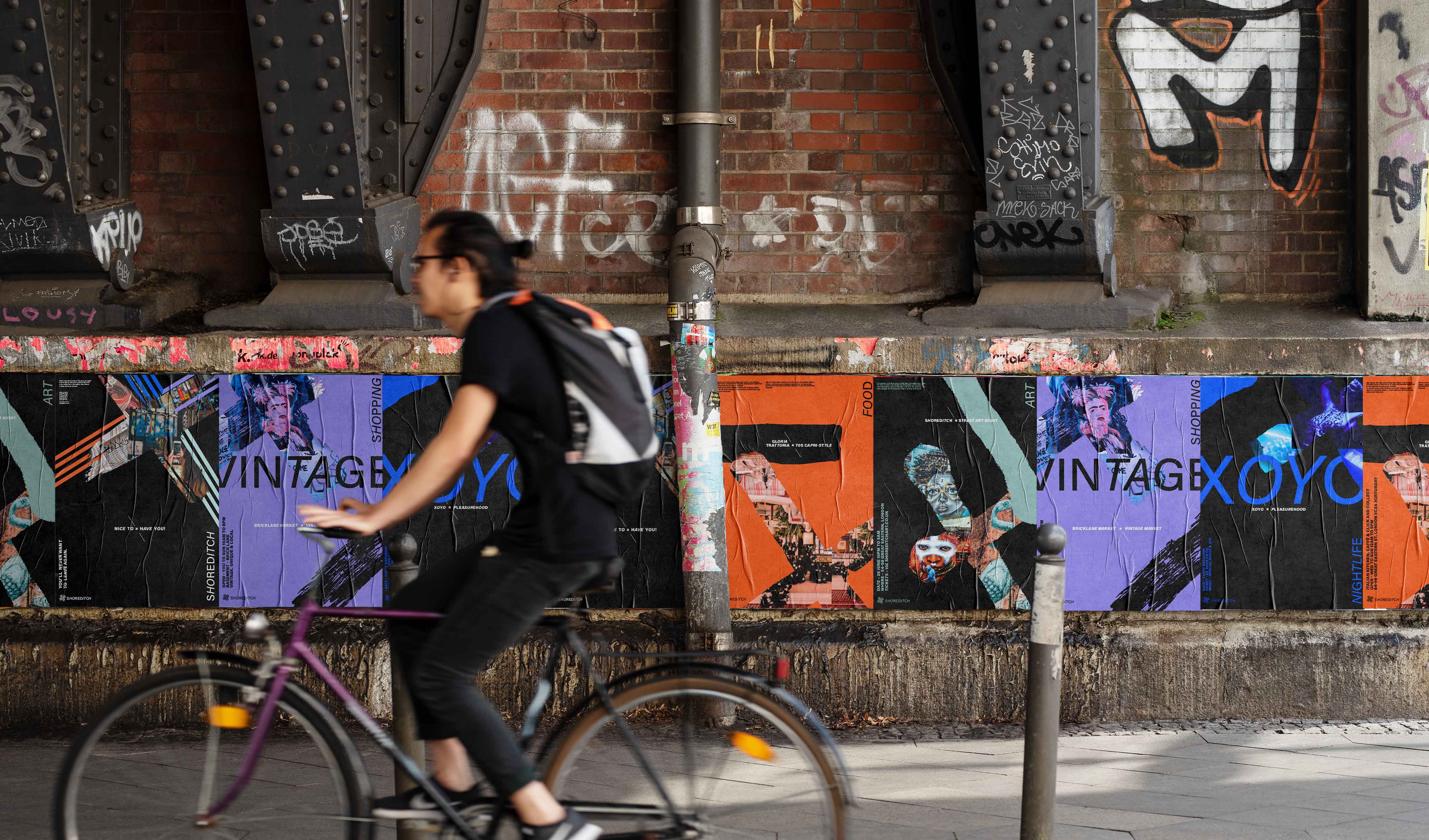
Logo – The cross is used as an element for highlighting the hotspot Shoreditch. The four lines of the logo represent the four most popular areas of the district – art, shopping, food and nightlife.


To emphasize the individuality of the areas, four colors were chosen, which were used to color the images as well. In addition, each area features a loosely painted, graffiti-like cross that perfectly reflects the vibe of the Shoreditch district.
 team: Yasmin Abdullahi, Maren Mesle